
Vue
Vue开发移动端实现px转rem
08-06 15:51在移动端使用 rem 做为基本单位,是一种传统且可靠的方法,它可以根据设备屏幕大小,动态调整布局、字体等大小,让页面在各种设备访问时都能保持一致性。
传统方案
传统开发过程中,通过引入一段 media 的 js 函数,开发时直接将单位设置为 rem,如下所示:
(function (doc, win) {
var docEl = doc.documentElement,
resizeEvt = 'orientationchange' in window ? 'orientationchange' : 'resize',
recalc = function () {
var clientWidth = docEl.clientWidth;
var box=document.body.getBoundingClientRect();
if (!clientWidth) return;
if (clientWidth > 640) { //根据设计稿宽度640px或750px设置对应的值
docEl.style.fontSize = '64px'; //根据设计稿宽度设置
return;
}
docEl.style.fontSize = (clientWidth / 10) + 'px';
};
if (!doc.addEventListener) return;
win.addEventListener(resizeEvt, recalc, false);
doc.addEventListener('DOMContentLoaded', recalc, false);
})(document, window);
这种做法开发时需要计算好 rem 后再写入代码中,步骤繁琐,增加工作量。
Vue 方案
使用 Vue 开发时, 通过 postcss-pxtorem 和 amfe-flexible 两个工具,实现移动端 rem 适配的。
1、安装依赖:
npm install amfe-flexible -S
npm install postcss-pxtorem -D
-
amfe-flexible 是项目运行依赖。
-
postcss-pxtorem 是开发依赖。
2、配置 postcss-pxtorem
在项目根目录创建 postcss.config.js 文件,这是构建时转换规则的配置文件
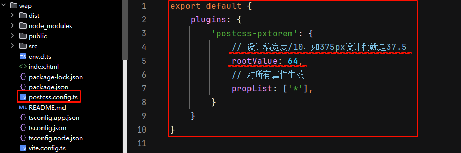
输入以下内容并保存:
// postcss.config.js
module.exports = {
plugins: {
'postcss-pxtorem': {
rootValue: 64 //关键参数,根据设计稿宽度调整,这里表示 1rem = 64px,满屏就是 640px = 10rem
propList: ['*'], //所有属性都转换
//propList: ['*', '!font-size'] //所有属性转换,但不转字体大小
exclude: /node_modules/i, //排除 node_modules 文件夹,可避免转换第三方库的样式
selectorBlackList: [ //排除特定选择器不转换 px
'norem', //类名包含 'norem' 的不转换,比如:.norem、.norem-box、.box-norem
/^\.no-rem-/, //类名以 'no-rem-' 开头的不转换,比如:.no-rem-title、.no-rem-container
],
},
},
};
注意:
⑴ rootValue 是配置的核心,决定了 px 到 rem 的换算比例,它的转换公式为:转换后的 rem 值 = 设计稿上的 px 值 / rootValue
⑵ 使用 exclude 配置可以避免转换第三方库(如 node_modules)的样式,防止样式错乱。
⑶ 通过 selectorBlackList 配置项,可以忽略特定样式,让某些选择器下的样式不转换
3、配置 main.ts (运行时适配)
打开项目入口文件 main.ts 中,做以下配置:
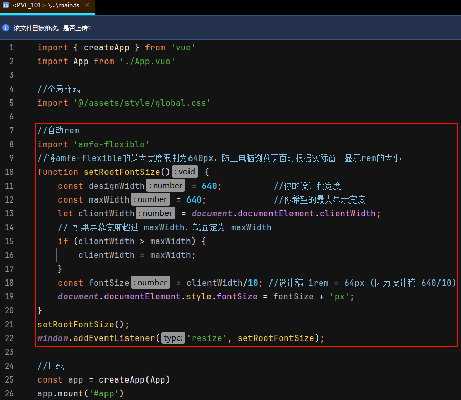
复制以下代码即可,注意宽度要设置成设计稿的宽度(常见的有:375、640、750)
//自动rem
import 'amfe-flexible'
//将amfe-flexible的最大宽度限制为640px,防止电脑浏览页面时根据实际窗口显示rem的大小
function setRootFontSize() {
const designWidth = 640; //你的设计稿宽度
const maxWidth = 640; //你希望的最大显示宽度
let clientWidth = document.documentElement.clientWidth;
// 如果屏幕宽度超过 maxWidth,就固定为 maxWidth
if (clientWidth > maxWidth) {
clientWidth = maxWidth;
}
const fontSize = clientWidth / 10; //设计稿 1rem = 64px (因为设计稿 640/10)
document.documentElement.style.fontSize = fontSize + 'px';
}
setRootFontSize();
window.addEventListener('resize', setRootFontSize);
4、使用与测试
配置完成后,在 Vue 组件中直接按照设计稿的标注写 px
<style scoped>
/* 设计稿标注 200px,直接写 200px */
.container {
width: 200px;
}
</style>
构建时,postcss-pxtorem 会自动将 px 转换为 rem
5、注意事项
⑴ 行内样式不转换:postcss-pxtorem 只处理 CSS 文件中的 px,模板中 :style 绑定的行内样式不会被转换。
⑵ 对于不想通过 postcss-pxtorem 自动转换的项,px使用大写即可,比如:max-width: 640PX; min-width: 320PX,这时将会直接输出这两项,不再转换。
⑶ 社区趋势:amfe-flexible 方案较旧,社区趋势是使用 viewport 单位(vw/vh)进行适配。但在需要兼容性较强的场景下,这套 REM 方案依然是可靠选择。
6、行内样式转换方式
对于行内样式(包括 js 方法内生成的样式),由于运行时间的晚于 postcss-pxtorem 转换时间,所以这种情况不会自动转换 rem,不过可以通过渲染后再次触发 postcss-pxtorem 的转换事件,强制要求再次转换指定元素的各种属性。
首先在 src/utils 目录下创建 px2rem.ts,并输入以下代码:
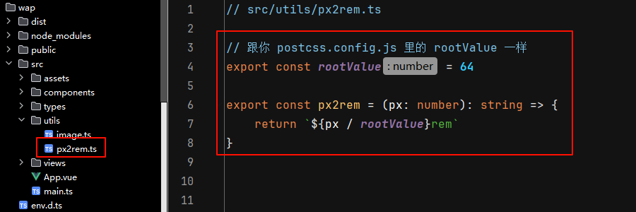
// src/utils/px2rem.ts
export const rootValue = 64 //跟你 postcss.config.js 里的 rootValue 一样
export const px2rem = (px: number): string => {
return `${px / rootValue}rem`
}
在需要的位置,引入并使用 px2rem,比如在 vue 文件中的使用方法:
<script>
import { px2rem } from '@/utils/px2rem'
const obj= { align: 'right', width: 120, top: 0, left: 7 }
const getItemStyle = (item: { width: number, top: number; left: number; align: string }) => ({
width: px2rem(item.width) || px2rem(100), //使用 px2rem 转换 rem,注意这里传入的是 number 类型,不要带 px
top: px2rem(item.top) || 'auto',
left: px2rem(item.left) || 'auto',
textAlign: (item.align || 'left') as 'left' || 'right' || 'center',
})
</script>
<template>
<div :style="getItemStyle(obj)">...</div>
</template>
重点注意:amfe-flexible 方案较旧,社区趋势是使用 viewport 单位(vw/vh)进行适配。但在需要兼容性较强的场景下,这套 rem方案依然是比较稳定和可靠的选择。